A modular booking flow.
Resorts World Genting is an integrated resort six thousand feet above sea level, located near Kuala Lumpur, Malaysia. In 2018, they started building new, family friendly attractions to appeal to non gamers and expand their audience. To support this new strategy, Genting needed a new booking flow that was simple, seamless, and could accommodate all of the nuance found in the new attraction types they were launching.
I was the design lead on the assignment, working with a talented senior designer and cross functional team to design a booking system that could expand and contract depending on what was being purchased, but still feel simple and familiar.
Insight
Looking at the web analytics, the team noticed their customers exhibited two distinct patterns while navigating the site, “browsing” and “buying”. While browsing, users would meander through the different hotels at the resort, look at different room options, read about the amenities, and read show descriptions. Their behaviour was relaxed and exploratory. But when they found the right mix of products, they were single minded. The booking process then had to offer a clear path from browsing to buying, and be available from anywhere in the application.
Design
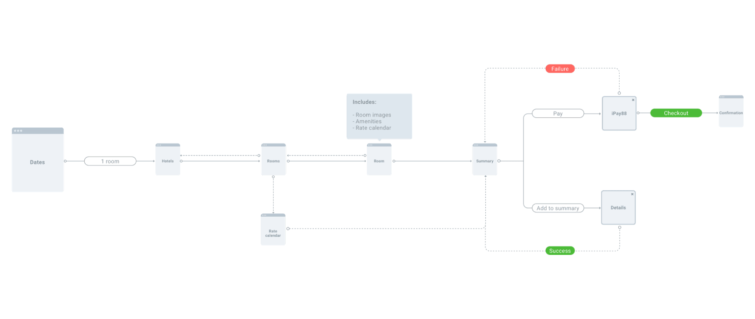
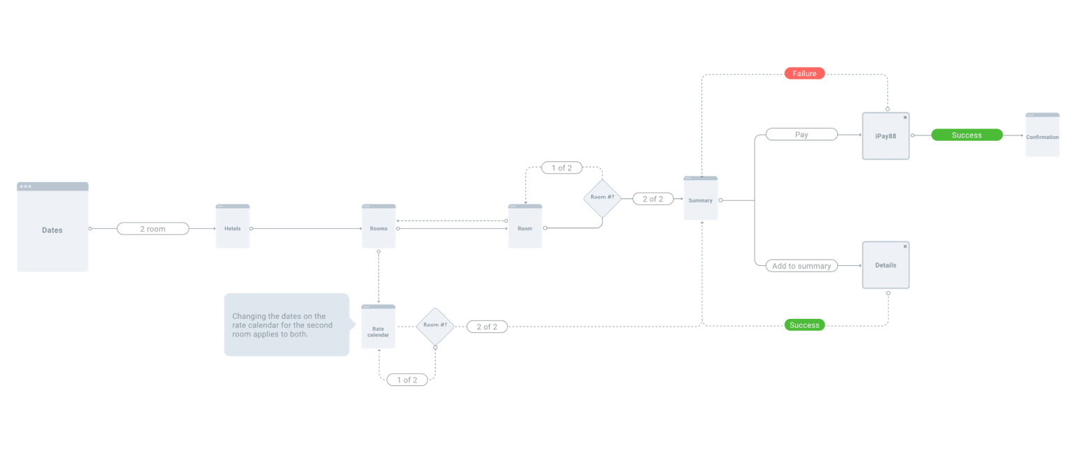
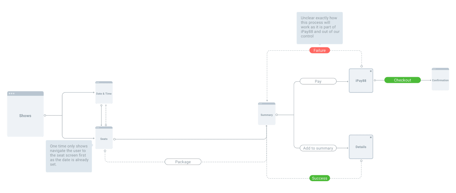
Working with Genting’s technical team, we began documenting the decisions users had to make when buying every type of product on the site. We knew we couldn’t change Genting’s architecture or fulfillment system, but we could make it easier to interact with. We created detailed user flows for every scenario, and used them to define the interface.
We decided to break the process up into a series of simple, modular steps that could be assembled to accommodate any product type. By designing a common set of components like selecting a date, deciding between two types of passes, or entering the number of guests, buying four floor seats at a concert would feel the same as booking a room for a week long stay. Our design was meant to be easy to learn and remember.
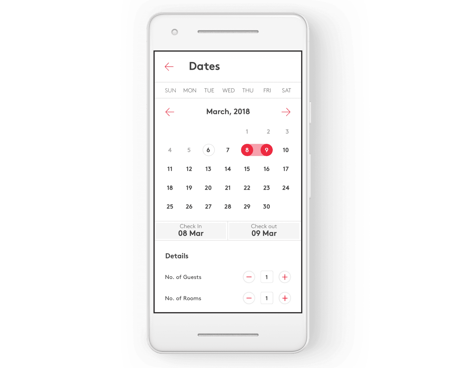
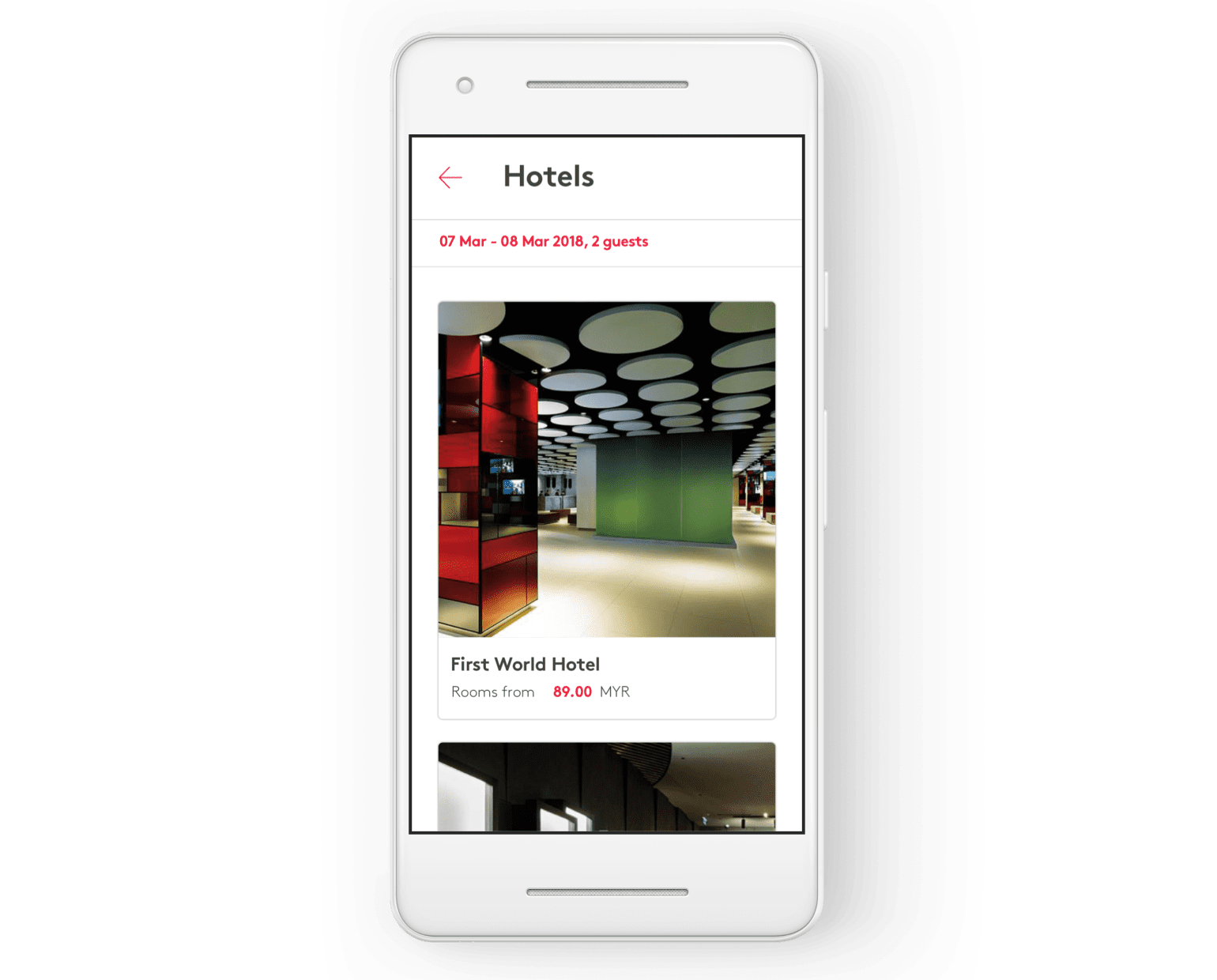
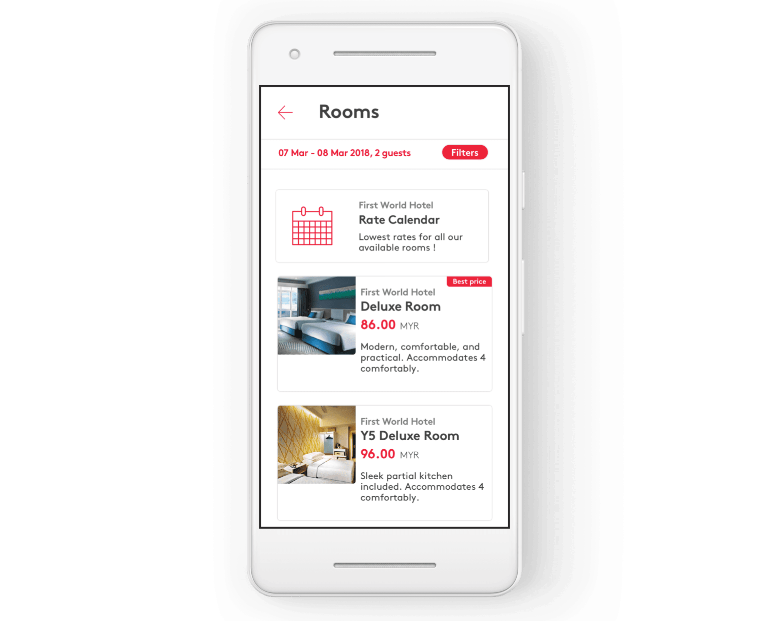
Interface design samples
Challenges
The biggest challenge the team faced was operating within Genting's existing technology architecture and fulfillment systems. Early iterations of the design required large changes to the underlying system, which wasn't possible at the time. We overcame this challenge by speaking with the technical and product teams at Genting every evening, showing the day's work and talking through our ideas and the technical implications. By working together, we were able to redesign the process in a way that benefitted customers while requiring few material changes to the underlying infrastructure.
Outcome
The new booking flow drove significant results. In the year following launch, hotel bookings were up 40% while drop off reduced by 60%. Customer reviews on the app store skewed positive and Genting has incorporated more sophisticated digital capabilities like digital keys into the platform.
